Photo courtesy of depositphotos.com
Color plays a powerful role in how a home feels. It can influence your mood, comfort and even how spacious or calm a room appears. Many homeowners focus on furniture, layout or lighting while overlooking color. Yet wall color is often the first thing the eye notices when entering a space.
A home painted without intention can feel cold, chaotic or tiring. On the other hand, a good wall-color color choice can make rooms feel welcoming, balanced and personal. Understanding how color works allows homeowners to shape the emotional experience of their living spaces instead of leaving it to chance.
Why Color Has Such a Strong Emotional Impact
Color affects the brain before we consciously process it. Certain shades trigger relaxation, while others stimulate energy or focus. This is why hospitals, offices and hotels invest heavily in color planning. Homes deserve the same attention, especially since people spend so much of their daily lives there.
Warm tones like soft beige, muted terracotta or warm gray can create a sense of comfort. Cool tones such as pale blue or sage green often bring calm and clarity. Bright or bold colors can add personality but may overwhelm if used without balance. The key lies in choosing colors that support how each space is meant to be used.
Common Problems Homeowners Face With Color Choices
Many homeowners struggle with color for a few simple reasons. One common issue is choosing colors based on trends rather than lifestyle. A shade that looks stunning online may feel uncomfortable in everyday life. Lighting also changes how color appears, causing surprises once the paint dries.
Another issue is lack of flow between rooms. When each space uses unrelated colors, the home can feel disjointed. People may also choose colors that are too intense for large surfaces, leading to visual fatigue. These mistakes are common, but they are also easy to fix with better planning.
How Different Colors Shape Mood
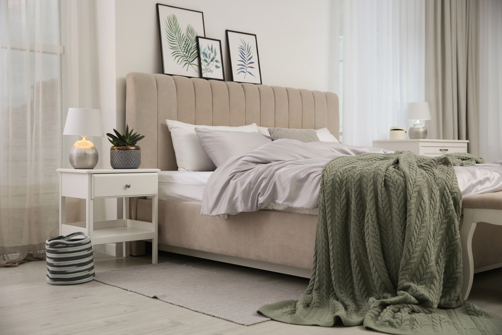
Photo courtesy of depositphotos.com
Each color family influences emotion in its own way. Understanding these effects can help homeowners make smarter decisions.
Neutral tones offer balance and flexibility. Soft whites, warm grays and gentle taupes allow furniture and decor to stand out. They also help small spaces feel open and calm.
Blues and greens promote relaxation. These shades work well in bedrooms, bathrooms and quiet living areas. They can reduce stress and support restful environments.
Yellows and warm creams add brightness. Used carefully, they bring optimism and warmth. Overuse of these colors, however, can feel harsh or overstimulating.
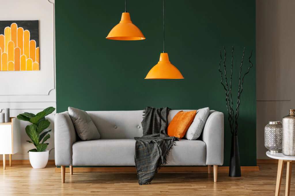
Deep tones like navy, charcoal or forest green add depth and elegance. When paired with good lighting, they create cozy and refined spaces rather than dark ones.
Matching Color to Function
Every room serves a purpose, and color should support that purpose. A living room often benefits from warm, inviting tones that encourage conversation. Bedrooms usually feel better with softer, calming shades. Kitchens may work well with clean, light colors that feel fresh and energizing.
Home offices require special care. Too much brightness can distract, while overly dark colors may feel heavy. Balanced neutrals or muted greens often help maintain focus without draining energy.
When color matches function, rooms feel more natural to use. This reduces the urge to constantly redecorate or repaint.
The Role of Light in Color Perception
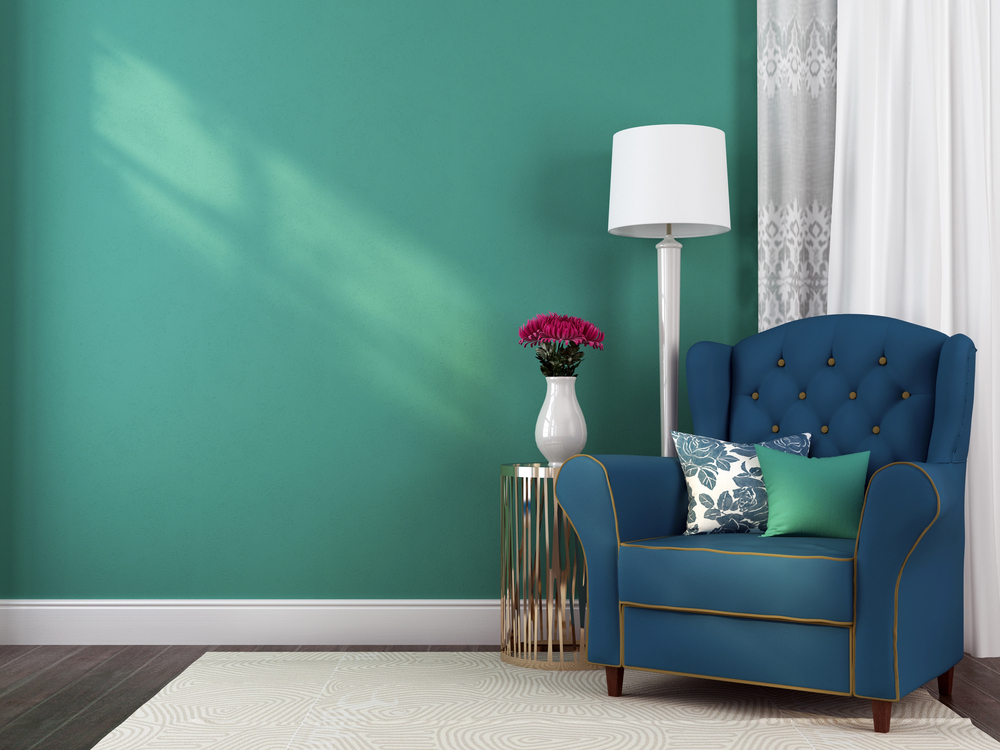
Photo courtesy of depositphotos.com
Light changes everything. Natural light reveals undertones that artificial light can hide. A gray wall may look warm during the day and cool at night. South-facing rooms handle darker colors better, while north-facing rooms often benefit from warmer shades.
Testing paint samples on different walls and observing them throughout the day prevents disappointment. This step is often skipped, leading to costly corrections later.
In many cases, homeowners turn to experienced painting contractors to avoid these issues. Professionals understand how light, surface texture and color depth work together, helping homeowners achieve the intended mood instead of unexpected results.
Creating Flow Throughout the Home
Color flow in a home is essential for visual harmony. This does not mean every room must match. Instead, there should be a clear relationship between shades. Using variations of the same color family or repeating accent tones helps create continuity
Hallways and open spaces benefit from neutral or transitional colors. These areas connect rooms and set the tone for the rest of the home. When flow is planned carefully, moving through the house feels smooth rather than jarring.
Using Accent Colors Without Overwhelming the Space
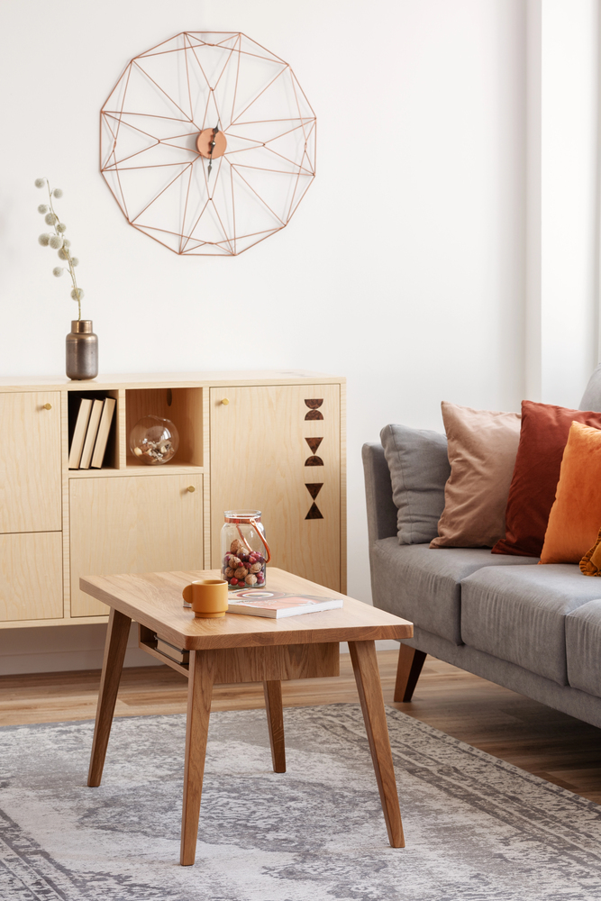
Photo courtesy of depositphotos.com
Accent colors add personality, but restraint is important. A bold wall, trim detail or feature area can energize a room. When accents are repeated in decor or furniture, they feel intentional instead of random.
Too many strong colors compete for attention. This creates visual noise rather than interest. Limiting accents to one or two shades keeps the space balanced and comfortable.
Color and Long-Term Satisfaction
One of the biggest challenges homeowners face is regret. A color may feel exciting at first but become tiring over time. Choosing timeless base colors and expressing personality through accents helps prevent this problem.
Homes evolve as families grow and needs change. Neutral foundations allow flexibility without constant repainting. When color choices support long-term comfort, homeowners feel more connected to their space.
When to Reconsider Your Current Color Scheme
Certain signs can suggest it may be time to update your wall colors. Rooms that feel smaller than they should, spaces that feel gloomy during the day, or areas that look chaotic despite minimal decor often suffer from poor color choices.
Color updates don’t always require dramatic changes. Sometimes adjusting the tone, brightness or finish can make a noticeable difference. Even small refinements can significantly improve your home’s look and feel.
Making Confident Color Decisions
Confidence comes from understanding. Homeowners who learn how color affects mood, light and space are less likely to make rushed decisions. Planning, testing and thinking beyond trends leads to better results. Whether refreshing one room or updating an entire home, thoughtful color choices can create spaces that feel supportive, comfortable, and personal. When color works well, a custom home does more than look good. It feels right.
Discover more from momhomeguide.com
Subscribe to get the latest posts sent to your email.
[…] Color plays a subtle but powerful role in how a home feels. Soft, balanced colors tend to make spaces feel calmer and more inviting. Overly bold or trendy colors may look appealing at first but can feel tiring over time. […]